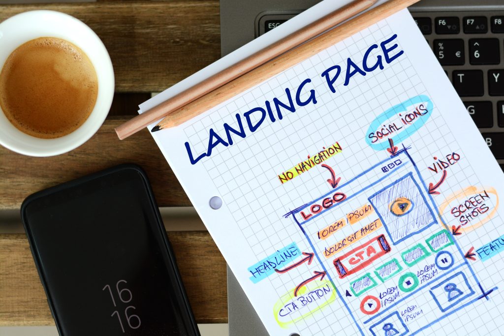
A landing page is a specific web page designed for a particular purpose in a marketing campaign. It’s where a visitor “lands” after they click on a link in an email, ads from Google, Bing, YouTube, Facebook, Instagram, Twitter, or similar places on the web.
Unlike standard web pages, a landing page provides targeted information and is designed with a single focus or goal, known as a call to action (or CTA, for short). This focus is what makes landing pages the best option for increasing the conversion rates of marketing campaigns.
Here are some examples of types of landing pages:
- Lead Generation Landing Pages: Also known as “lead gen” or “lead capture” pages, these use a form as their call to action. This form almost always collects lead data, like the names and email addresses of visitors.
- Clickthrough Landing Pages: Typically used by e-commerce and SaaS (Software as a Service) marketers, clickthrough pages aim to persuade the visitor to click through to another page. Often used in a funnel for e-commerce transactions.
- Squeeze Pages: These are landing pages designed to capture opt-in email addresses from potential subscribers. The goal of a squeeze page is to convince, cajole, or otherwise ”squeeze” a visitor into providing one of their most sought-after and coveted pieces of personal data: the email address.
Landing pages are powerful marketing tools, as they provide a customized sales pitch for the visitor. Since the content and offers can be tailored to the visitor’s interest or the source of their traffic, landing pages can greatly increase conversion rates.

What Makes a Good Landing Page
Creating a high-converting landing page involves a blend of art and science. While the specific elements can vary depending on the nature of your business or campaign, certain commonalities have been proven to boost conversion rates. Here are some of the most important elements:
- Headline: The headline is typically the first thing visitors see, so it needs to be compelling and clear about what the product or service is. It should align closely with the ad or link that brought the visitor to the page.
- Subheadline: This can be used to supplement the headline by offering a secondary supporting statement to add clarity to the unique selling proposition.
- Unique Selling Proposition (USP): The USP is a clear statement that outlines how your product or service differs from and is superior to that of your competitors.
- Images or Videos: High-quality and relevant images or videos can help visitors visualize your product or service, making it more appealing. In some cases, videos can increase conversions by providing detailed explanations or demonstrations.
- Benefits and Features: Listing the benefits and features of your product or service can help visitors understand what they’ll get. Benefits should be customer-focused and tell users how their problems will be solved.
- Social Proof: Testimonials, reviews, or logos of well-known clients can build trust and credibility with your visitors.
- Call to Action (CTA): The CTA is one of the most important parts of your landing page. This tells the visitor exactly what you want them to do, whether it’s filling out a form, making a purchase, or something else. The CTA should be clear, compelling, and concise.
- Lead Capture Form: If the goal of your landing page is to collect visitor information, you’ll need a form. Keep it as simple as possible to increase conversion rates.
- Trust Elements: Trust badges, security seals, and guarantees can help make visitors feel more comfortable about giving their information or making a purchase.
- Responsive Design: Your landing page should look and function well on all devices—desktops, tablets, and smartphones.
Remember, an effective landing page isn’t just about having all these elements—it’s about how they’re used. They should work together cohesively, be engaging, and guide the visitor toward the action you want them to take. It’s also important to continuously test and tweak your landing pages to find out what works best for your audience.
Crazy Landing Page Video Statistics
Adding a video to a landing page can significantly increase conversion rates, but the exact amount can vary greatly depending on various factors such as the quality of the video, its relevance to the product or service, and the target audience.
According to various studies and industry reports up until my knowledge cutoff in September 2021, including a video on a landing page, can increase conversions by up to 80%. However, this is a generalized statistic and actual results can greatly vary.
It’s important to note that simply adding a video to a landing page doesn’t guarantee increased conversions. The video must be high-quality, engaging, and effectively communicate the value proposition. Poorly made or irrelevant videos could potentially harm conversion rates. Additionally, the video should complement the other elements on the page and not distract from the main call to action.
Testing different versions of landing pages (A/B testing) can be a good strategy to measure the impact of adding a video or making any other significant change. This involves creating two versions of the landing page with one difference between them—the presence of a video, for example—and then seeing which version performs better.
